HYPHENATION AND JUSTIFICATION (H&J)
Most books, especially text only ones, are set with justified text. In other words, the text lines up on the right side of the page as well as the left, except for the last line of the paragraph. The first line is often indented from the left margin as well. Hyphenation and justification settings are needed to avoid ugly spacing, though I prefer to keep hyphenation to a minimum.
Default Settings
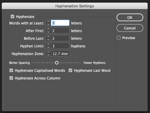
These are the standard settings in InDesign for hyphenation and justification:


I have never set anything using these settings! A block of text may well be perfectly spaced but the hyphenation could make it look odd.
My revised settings
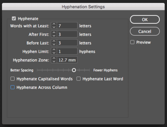
Accordingly, I changed these settings. Mine are as follows but further adjustment may be needed depending on the font used:


Occasionally, these settings may still lead to some odd spacing. I would then use discretionary hyphens, and/or move the slider back towards the middle between ‘Better Spacing’ and ‘Fewer Hyphens’ on an affected paragraph, and/or revise the justification settings.
Showing the difference between the hyphenation and justification settings
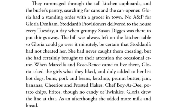
These samples show the effect of the adjustment on some text from a fiction book, using Adobe Garamond Pro at 11.5/15pt.
InDesign standard settings:

My revised settings:

Both samples use the Adobe InDesign Paragraph composer, as opposed to Single Line composer. This means InDesign works out the best spacing for the paragraph as a whole. Certainly, the hyphenation looks rather clumsy in the first sample. Having capitalised words with hyphens, consecutive hyphens creating a ‘hyphenation ladder’, and words hyphenated after just two characters are all to be avoided if possible. I would normally avoid single words on the last line of a paragraph too. They are known as runts, and they’re not pretty. The word spacing in the revised sample remains perfectly acceptable.
In Summary
In summary, I prefer:
- To hyphenate only longer words
- To avoid consecutive hyphens in a paragraph
- Not to hyphenate the last word in a paragraph
- Not to hyphenate capitalised words (though I may occasionally use a discretionary hyphen for these)
- To reduce the variation on word spacing
- To allow InDesign a bit of flexibility on the letter spacing – especially in tight columns
And all of this helps make your book beautifully easy to read.
See how this works in practice by checking out the samples in my portfolio.
For information about hiring me to design your book, schedule a virtual cuppa to discuss your project.

