WORD SPACING
SHOCK HORROR!! Some people still use two spaces after the end of a sentence. The problem is that this habit can cause a lot of problems in the readability of the text because the word spacing is too gappy.
I learned to touch type on a manual typewriter at the age of 16 – showing my age! In those days, fixed pitch spacing, that is every character took up the same amount of space on the page, was the only option and it took a few calculations to get a table nicely set up.
Nowadays, with the exception of mono-spaced fonts such as Courier, fonts are generally proportionally spaced so it is not necessary to create a larger gap between sentences. Some people say that it is a personal preference. I would agree except that in book publishing (also newspapers, magazines and other printed material) having this extra space in justified text can cause extra wide gaps that are not easy on the eye and disrupt the flow of the paragraph, making it harder to read.
SAY NO TO DOUBLE SPACES!
One of the first things I do, when in receipt of a script for typesetting, is to replace all the double spaces with single ones. Here is a sample piece of justified text with double spaces to show the problem:
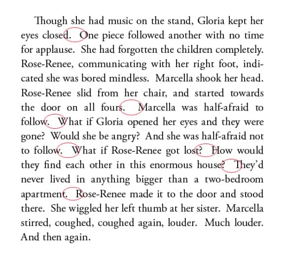
BETTER WITH SINGLE SPACES
Truly, spacing like that is unacceptable in a book. Here is the same text with single spaces:
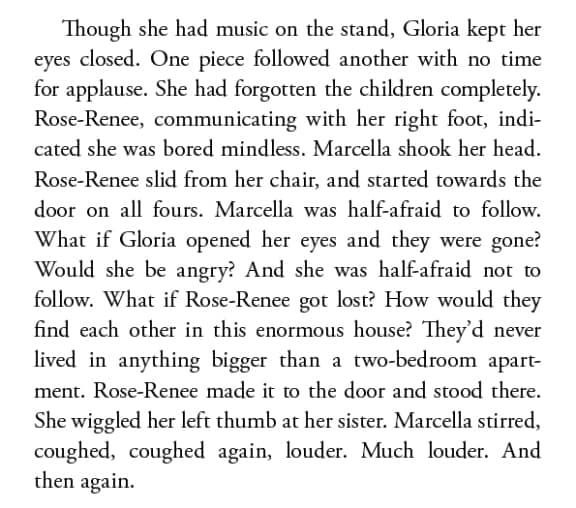
Much better! It is still perfectly clear where the sentences end.
While I’m on the subject of spacing, some people also use multiple spaces to indent the first line of their paragraphs. Another round of find and replace becomes necessary before typesetting as, in my experience, the number of spaces is rarely consistent throughout. It is better to use a tab for consistency, and better still to define a paragraph style with a first line indent. (More about paragraph and character styles coming soon.)